
Last reviewed: May 26, 2026
Creative ads are not just polished videos, clever hooks, or platform-native edits. For ecommerce teams, the best creative ads are controlled product arguments: each ad tests one buyer motivation, one objection, one proof point, or one offer in a format that can be measured. That is why a useful examples article should not stop at "make it short" or "use UGC." It should show what each example is trying to prove.
This guide gives ecommerce marketers practical creative ads examples for product video testing across TikTok, Instagram Reels, Meta feed, YouTube Shorts, Google video placements, Amazon product contexts, and landing pages. Use the examples as a creative menu, then turn them into a testing matrix instead of launching random variations.
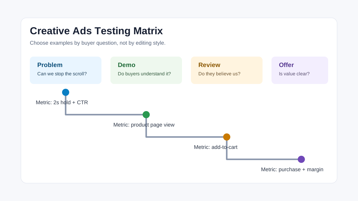
Quick Answer
The strongest creative ads examples for ecommerce video testing usually fall into seven patterns: problem-solution, product demonstration, creator review, before-after, comparison, objection handling, and offer-led urgency. Each pattern should be tested with one clear hypothesis. For example, a problem-solution ad tests whether the pain point is strong enough to earn attention, while a product demonstration tests whether viewers understand the product fast enough to click or buy.
A practical ecommerce testing set should include:
- One product demonstration ad that shows the item in use.
- One problem-solution ad that names the buyer's pain in the first three seconds.
- One review or creator-style ad that makes the claim feel human.
- One comparison ad that explains why the product is different from the default alternative.
- One objection-handling ad that addresses price, fit, quality, shipping, trust, or setup.
- One offer-led ad that tests whether the promotion changes conversion behavior.
- One platform-native short ad built for the feed, not copied from a polished brand video.
The goal is not to find one universal winner. The goal is to learn which product angle deserves more budget, then use that evidence to build better video variants through a workflow such as dynamic creative optimization for ecommerce video ads.
Why Creative Ads Examples Need a Testing Lens
Most ecommerce brands collect ad examples the wrong way. They save ads that look good, copy the editing style, and then wonder why the result does not convert. The missing step is diagnosis. A creative example is only useful if you can name the job it performs inside the buyer journey.
A hook-heavy TikTok ad may be good at stopping the scroll but weak at proving product value. A polished product demo may be clear on a landing page but too slow for Reels. A founder story may build trust for an expensive product but underperform for a low-priced impulse item. A discount ad may lift short-term conversion while teaching the audience to wait for a sale.
That is why every example in this article is framed with four questions:
- What buyer problem or motivation does this creative test?
- What product evidence must appear on screen?
- Which platform or placement is most likely to fit the format?
- What metric should decide whether the idea deserves another version?
This approach also protects the article from competing with ShopShot's pSEO tool pages. The target here is examples, scripts, and testing logic. The tool pages should own generator and platform-specific tool intent; this blog supports them by helping sellers decide what to make.
Source Context Checked for 2026
Current platform guidance supports the same direction: creative needs to be varied, platform-native, and measurable.
TikTok's creative best practices for performance ads emphasize TikTok-first creative, vertical 9:16 videos, safe-zone visibility, sound, and continuous testing rather than one final perfect ad. TikTok also points advertisers to Creative Center for ad inspiration.
TikTok Creative Center describes a public resource for trends, ad examples, best practices, products, and creative tools. Its Top Ads and product inspiration workflows are especially useful when you want examples without copying another brand's claim.
Meta Advantage+ Creative positions creative diversification as part of performance optimization, with AI-assisted resizing, text generation, image expansion, background generation, music generation, and ad variations. Meta Reels ads guidance highlights 9:16 video, audio, and safe-zone discipline for Reels.
Google Ads video guidance reinforces that video orientation and creative length should match the ad objective and placement, and that vertical assets matter for Shorts delivery. Google's vertical video note for YouTube also explains why vertical creative can change Shorts performance.
Amazon Ads ecommerce creative specs show a different constraint: ads may automatically include ecommerce elements such as product imagery, deals, reviews, or CTAs, so custom visuals should avoid duplicating information or making unsupported pricing and savings claims. Amazon Sponsored Products video guidance is relevant for sellers repurposing product detail page videos.
Creative Ads Examples Matrix
Use this table as a starting set. Do not launch all examples with the same hook, same caption, and same thumbnail. Each row should test a different reason to believe.
| Example type | Best for | Opening idea | Product proof needed | Primary metric |
|---|---|---|---|---|
| Problem-solution | Pain-aware shoppers | "Still dealing with..." | Before state, product action, after state | Hook hold and click-through rate |
| Product demo | New or unfamiliar products | "Here is how it works in 15 seconds" | Clear use sequence and result | Landing page view rate |
| Creator review | Trust gaps | "I did not expect this to matter..." | Authentic usage, limitation, benefit | Add-to-cart rate |
| Before-after | Visual categories | "This is what changed after one use" | Honest before/after and timeframe | Conversion rate |
| Comparison | Crowded categories | "I replaced my usual... with this" | Side-by-side difference | Cost per purchase |
| Objection handling | High-friction products | "If you are worried about fit..." | Size, setup, return, quality, warranty | Checkout start rate |
| Offer-led | Promotion windows | "Today the bundle costs less than..." | Offer, deadline, included items | Purchase rate and margin |
| Founder or maker story | Premium products | "We made this because..." | Origin, design choice, product detail | Saves, comments, assisted conversions |
| Social proof stack | Review-rich products | "The reason buyers keep mentioning..." | Review themes, star rating, usage clips | Add-to-cart rate |
| Use-case montage | Multi-use products | "Three ways to use this in one week" | Distinct use cases | Product page engagement |
| Unboxing | Giftable products | "What arrives in the box" | Packaging, included parts, scale | Return-rate risk and conversion |
| Challenge or test | Claims that need proof | "Can it handle this?" | Stress test, result, limitation | Watch time and qualified clicks |
1. Problem-Solution Ad
A problem-solution ad works when the buyer already feels a specific pain but has not connected that pain to your product. The opening should name the problem in the buyer's language, not the brand's language.
Example structure:
- Shot 1: Show the annoying moment, such as a messy drawer, dead phone, pet hair, dull skin, tangled cable, slow meal prep, or uncomfortable shoe.
- Shot 2: Name the cost of the problem in a short caption.
- Shot 3: Show the product solving one part of the issue.
- Shot 4: Show the improved state.
- Shot 5: Add a direct CTA tied to the problem.
For ecommerce video testing, this example should be judged by early hold rate and click-through rate. If viewers stop but do not click, the pain may be relatable but the product proof may be weak. If viewers click but do not buy, the landing page may need clearer proof, pricing, or delivery information.
This format is useful for home organization, beauty, pet care, accessories, kitchen tools, travel products, and products that solve visible friction. It is weaker for products where the buyer needs a long explanation or where the problem is abstract.
2. Product Demo Ad
A product demo ad is the cleanest format for a product people do not understand at first glance. It should answer: what is it, how does it work, what changes after using it, and what should the viewer do next?
Good product demos are not mini documentaries. They use short, clear scenes:
- Hold the product near a familiar object for scale.
- Show the product being opened, attached, worn, poured, cleaned, charged, assembled, or used.
- Use text overlays only for the details a viewer cannot infer visually.
- Show the final state before the CTA.
A common mistake is spending the first five seconds on packaging or lifestyle shots. If the product is unfamiliar, the first scene should show the outcome or the action. Beauty, electronics, home, fitness, kitchen, garden, and baby products usually benefit from a demo-first creative.
Measure demo ads by product page view rate, add-to-cart rate, and support-ticket reduction. If a demo improves conversion but creates more returns, the video may be overselling the result or hiding an important limitation.
3. Creator Review Ad
A creator review ad works when the audience needs a human reason to believe the product is worth trying. It should not sound like a fake testimonial. The strongest versions include a small hesitation, a specific use case, and one concrete detail.
Example script:
"I bought this because my desk was always covered in cables. I thought it would just look cleaner, but the useful part is that I can grab the charger with one hand without pulling everything off the table. If your desk is small, this is the part I would check first."
The point is specificity. A review that says "this product is amazing" is hard to trust. A review that says "this fits under my 24-inch monitor and keeps three cables separated" gives the buyer something to evaluate.
Use this format for products where social proof matters: apparel, beauty, wellness, home decor, pet supplies, creator tools, or premium accessories. Review ads should be checked for claim accuracy, disclosure, and whether the creator is making promises the product page cannot support.
4. Before-After Ad
Before-after creative is powerful because it compresses the product promise into one visual contrast. It is also risky because exaggerated results can violate platform policies, create disappointed buyers, or damage trust.
A safer ecommerce structure is:
- Show the baseline state honestly.
- State the timeframe or context.
- Show the product being used.
- Show the after state without unrealistic editing.
- Add a limitation or best-use note when needed.
Before-after ads work best for cleaning, organization, beauty, apparel fit, home improvement, pet care, and visual setup products. They should be avoided or heavily qualified for health, finance, supplements, body outcomes, or anything where individual results vary.
The metric is not only conversion rate. Track refund rate, comments, ad rejection risk, and support messages. A before-after ad that converts but creates claim disputes is not a winner.
5. Comparison Ad
A comparison ad helps buyers understand why this product is different from the default option. The comparison can be against a previous habit, a generic alternative, a manual workaround, or an older product type. It does not need to attack a competitor.
Example angles:
- "Traditional organizer vs magnetic organizer."
- "Cotton tote vs insulated grocery bag."
- "Manual frother vs rechargeable frother."
- "Generic cable vs braided 100W cable."
- "Studio product video vs AI-assisted product video workflow."
The comparison must be fair. Show the criteria that matter: time, mess, fit, durability, portability, storage, output, comfort, or repeat cost. Avoid vague claims such as "better quality" unless the video shows what that means.
Comparison ads are strong for crowded categories where buyers already know the product type but need a reason to switch. Judge them by cost per purchase and assisted conversion value, not only thumb-stop rate.
6. Objection-Handling Ad
Many ecommerce ads fail because they sell the benefit while ignoring the reason buyers hesitate. Objection-handling creative turns the hesitation into the hook.
Common ecommerce objections:
| Objection | Video proof to show | Good opening |
|---|---|---|
| Will it fit? | Size chart, model reference, object scale | "If you are between sizes, watch this first" |
| Is it hard to set up? | First-use sequence | "Here is the full setup, no cuts" |
| Is it durable? | Material close-up, stress test | "This is the part that usually breaks" |
| Is it worth the price? | Cost-per-use or bundle breakdown | "The reason it costs more is..." |
| Will it arrive as shown? | Unboxing and included parts | "Here is exactly what comes in the box" |
| Is the claim real? | Demonstration and limitation | "It works best when..." |
This example type is especially useful after you have comments, customer support questions, or review objections. It may not get the highest click-through rate, but it can improve qualified conversion and reduce buyer anxiety.
7. Offer-Led Ad
An offer-led ad is not the same as a discount banner. A good offer creative explains why the offer is relevant now and what the buyer gets. The product still needs proof.
Better offer openings:
- "The starter kit is cheaper than buying these three items separately."
- "This bundle solves the full morning routine, not just one step."
- "The refill pack makes sense if you already use it twice a week."
- "This is the version to buy if you are gifting it."
Offer-led ads should be measured with margin in mind. A sale can improve purchase volume and still harm contribution profit. Track purchase rate, average order value, discount dependency, and repeat purchase behavior.
Use offer ads when the product already has enough proof and the remaining question is value. Do not use the offer to hide weak positioning.
8. Founder or Maker Story
Founder-led creative can work when the product has a design decision that is hard to communicate in a standard demo. The founder should explain the product problem, not deliver a brand manifesto.
Good structure:
- "We kept seeing customers struggle with..."
- "The design choice we made was..."
- "Here is the detail that changed the outcome..."
- "This is who it is best for, and who should skip it."
This works for premium goods, niche products, handmade items, patented designs, sustainability claims, and products with a strong reason for existing. It is weaker for commodity products where the buyer only cares about price and delivery.
The best metric may be assisted conversion, email capture, saves, comments, or branded search lift. Founder ads often educate before they convert.
9. Social Proof Stack
A social proof ad turns repeated review themes into a video argument. Instead of flashing ten random reviews, group them by what buyers care about.
Example structure:
- "The three things buyers keep mentioning..."
- Review theme 1: comfort.
- Review theme 2: setup time.
- Review theme 3: durability.
- Product shot that supports each theme.
- CTA to see the product details.
This format is strong when your reviews are specific and consistent. It is weak when reviews are generic, incentivized, or unrelated to the purchase decision.
For compliance, do not imply that every buyer will get the same result. Keep review snippets truthful and avoid editing them into unsupported claims.
10. Use-Case Montage
A use-case montage shows several ways to use one product. It is useful when buyers underestimate the product's range or when different audiences buy for different reasons.
Example for a portable light:
- Clip 1: desk setup.
- Clip 2: travel bag.
- Clip 3: nightstand.
- Clip 4: product photography.
- Clip 5: emergency backup.
A montage is not a proof ad by itself. It should be paired with one clear product benefit, such as portability, durability, easy setup, or value. Otherwise it becomes a fast slideshow with no reason to buy.
Measure by product page engagement, viewed product details, and which use case drives comments or clicks. Then spin the strongest use case into a dedicated ad.
11. Unboxing Ad
Unboxing ads help when the purchase experience matters: gifts, premium packaging, bundles, electronics, kits, accessories, subscription products, or anything with multiple parts. The value comes from clarity and expectation setting.
A good unboxing ad shows:
- Shipping box or package condition.
- All included items.
- Scale and texture.
- The first action after opening.
- Any setup, charging, washing, fitting, or pairing step.
Do not overproduce the unboxing so much that the real delivery feels worse. If packaging varies by region or inventory batch, avoid promising exact packaging unless it is guaranteed.
Unboxing ads can reduce hesitation and returns, especially for giftable products where buyers care about presentation.
12. Challenge or Test Ad
A challenge ad puts the product under a visible test. It can be powerful for durability, capacity, stain resistance, battery life, waterproofing, speed, or ease of use. The test must be fair and repeatable.
Good challenge hooks:
- "Can this bag hold a full grocery run?"
- "Will this pan clean after burnt sauce?"
- "How long does setup actually take?"
- "Can it charge a laptop and phone at the same time?"
- "Does the strap stay comfortable after a full day?"
Avoid tests that are staged beyond normal use. If the product is not designed for extreme conditions, do not imply that it is. The best challenge ads show the product's real operating range.
Judge this format by watch time, qualified clicks, and comment quality. Strong challenge ads often generate questions that can become the next objection-handling creative.
Turn Examples Into a Testing Workflow
Creative testing should be structured enough to learn, but not so rigid that it slows production. Use this five-step workflow.
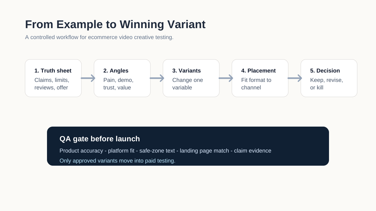
Step 1: Build a Product Truth Sheet
Before creating videos, write down the product facts that every ad must respect:
- Product name, category, price, and offer.
- Primary buyer problem.
- Main product mechanism.
- Supported claims and evidence.
- Size, material, use limits, compatibility, ingredients, or care rules.
- Customer review themes.
- Return reasons or objections.
- Platform policy constraints.
This truth sheet prevents AI tools, editors, creators, or agencies from inventing claims that are not on the product page.
Step 2: Pick Three Creative Angles
Choose three different buyer motivations, not three edits of the same ad. For example:
| Angle | Best example type | Hypothesis |
|---|---|---|
| Pain relief | Problem-solution | Buyers click when the first scene names the pain clearly |
| Product clarity | Product demo | Buyers convert when they understand the mechanism fast |
| Trust | Creator review or social proof | Buyers need a human proof point before checkout |
If you cannot describe the difference between two angles, they are probably not separate tests.
Step 3: Build Variants Around One Variable
Change one major variable at a time: hook, proof type, spokesperson, format, offer, or CTA. Do not change everything at once. If the winning ad has a different hook, different product shot, different offer, different voice, and different audience, you will not know what worked.
A simple starter set:
- Variant A: Problem hook plus product demo.
- Variant B: Creator review plus same product demo.
- Variant C: Objection hook plus same product demo.
- Variant D: Offer hook plus same product demo.
This keeps the product proof stable while testing the opening angle.
Step 4: Match the Creative to the Placement
A video that works on one placement may fail on another because the context changes. TikTok and Reels need fast openings, native pacing, audio, captions, and safe-zone awareness. YouTube Shorts needs vertical video and a strong first moment. Amazon contexts require product clarity and policy discipline. Landing pages can handle slower explainers because the visitor is already evaluating the product.
Use this placement map:
| Placement | Creative priority | Avoid |
|---|---|---|
| TikTok feed | Native hook, sound, fast proof | Polished TV-style opening |
| Instagram Reels | 9:16, audio, safe-zone text | Cropped product detail |
| Meta feed | Clear benefit and thumbnail | Tiny text or long setup |
| YouTube Shorts | Vertical story and strong first scene | Landscape-only assets |
| Amazon product context | Product clarity and accurate claims | Duplicate CTA or unsupported savings claim |
| Product landing page | Demo, comparison, objection handling | Vague lifestyle montage |
Step 5: Decide Winners by Business Impact
Do not crown a winner only because it has cheap clicks. Match the metric to the job.
| Creative job | Useful early metric | Business metric |
|---|---|---|
| Stop the scroll | 2-3 second hold rate | Qualified click-through rate |
| Explain product | Landing page view rate | Add-to-cart rate |
| Build trust | Saves, comments, review clicks | Checkout start rate |
| Prove value | Product detail engagement | Purchase conversion rate |
| Support offer | Click-through rate | Purchase rate and margin |
| Reduce hesitation | FAQ clicks, support comments | Lower return or refund risk |
If a creative gets attention but sends poor-fit traffic, treat it as a bad signal. If a creative has modest reach but high conversion quality, it may deserve a second variant before you drop it.
Common Mistakes When Copying Creative Ads Examples
The first mistake is copying another brand's editing style without copying the strategic context. Their winner may depend on price, review volume, brand familiarity, celebrity trust, shipping speed, or a landing page you do not have.
The second mistake is testing too many ideas with too little spend or traffic. If every ad is a different angle, format, offer, and landing page, the result becomes noise. Start with fewer variables and build depth around signals.
The third mistake is making every ad a discount ad. Offers matter, but if the only winning hook is price, the brand may have a positioning problem.
The fourth mistake is using AI-generated claims without evidence. AI can help generate scripts, variants, and storyboards, but it should not invent reviews, medical outcomes, durability claims, or product results. Use the QA gate described in Ad Creative AI for Ecommerce: Turning Product Pages into Video Ads before publishing.
The fifth mistake is ignoring negative signals. Comments about confusion, sizing, quality, or shipping are not just moderation tasks. They are creative research. Turn them into objection-handling ads or product page improvements.
A Practical 7-Day Creative Testing Plan
This plan is designed for a small ecommerce team that can produce multiple short videos but does not have a large media budget.
| Day | Action | Output |
|---|---|---|
| 1 | Build product truth sheet and review objections | One brief with claims, proof, limits, and buyer objections |
| 2 | Choose three creative angles | Problem, demo, trust, comparison, or offer hypotheses |
| 3 | Create four short video scripts | Same product proof with different openings |
| 4 | Produce vertical video variants | 9:16 videos with captions and safe-zone text |
| 5 | QA every claim and landing page match | Approved files and rejected claims list |
| 6 | Launch controlled test | Same product, same landing page, distinct creative variables |
| 7 | Read early signals and plan next variants | Keep, revise, or kill each angle |
This plan pairs well with a production article such as How to Make a Video Ad for an Ecommerce Product, because examples only become useful once you convert them into scripts, scenes, and assets.
FAQ
What are creative ads in ecommerce?
Creative ads are ad assets that communicate a product angle through video, image, copy, audio, or layout. In ecommerce, the most useful creative ads do more than look attractive. They test a buyer motivation, product proof point, objection, offer, or use case.
What are the best creative ads examples for product videos?
The best starting examples are product demonstration, problem-solution, creator review, comparison, objection handling, before-after, and offer-led videos. Pick the format based on the product's biggest conversion barrier.
How many video ad examples should I test first?
A small ecommerce team should usually test three to five distinct angles before producing dozens of edits. Start with one stable product demo and vary the hook or proof angle. Expand only after one angle shows a useful signal.
Should I copy ads from TikTok Creative Center or Meta ad examples?
Use public ad examples for pattern research, not direct copying. Note the hook, pacing, product proof, CTA, and format, then rebuild the idea around your product facts, claims, audience, offer, and landing page.
Can AI help create creative ad examples?
Yes. AI can help turn a product page into scripts, scene ideas, voiceovers, and variants. The important safeguard is a human review gate that checks claims, product accuracy, platform fit, disclosures, and landing page consistency before the ad goes live.
Sources Checked
- TikTok For Business, Creative best practices for performance ads, checked May 26, 2026.
- TikTok For Business, About Creative Center, checked May 26, 2026.
- TikTok For Business, How to use the Top Ads Dashboard, checked May 26, 2026.
- Meta for Business, Meta Advantage+ Creative, checked May 26, 2026.
- Meta for Business, Instagram and Facebook Reels ads, checked May 26, 2026.
- Google Ads Help, About Video views, checked May 26, 2026.
- Google Ads and Commerce Blog, Vertical video solutions for YouTube, checked May 26, 2026.
- Amazon Ads, eCommerce display creatives guidelines and ad specs, checked May 26, 2026.
- Amazon Ads, A complete guide to setting up Sponsored Products video, checked May 26, 2026.