
Quick Answer
A strong product video editing checklist should confirm eight things before launch: the product appears immediately, the customer problem is clear, every claim has visible proof, captions work without sound, the CTA matches the landing page, the edit fits each placement, the export is clean on a phone, and the final video has no policy-risk language or misleading before-and-after framing.
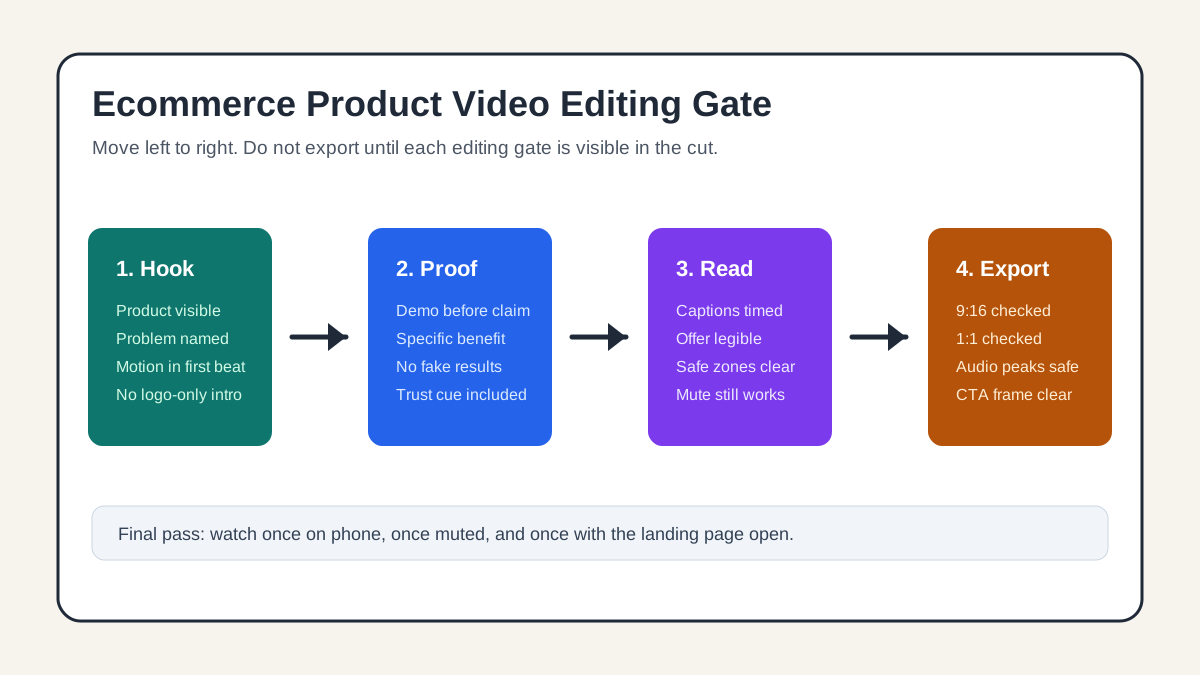
For ecommerce ads, editing is not just trimming a video until it feels faster. It is the last quality gate before you spend money on distribution. A good edit helps a shopper understand what the product is, why it matters, what proof supports the claim, and what to do next.
Use this checklist when you are reviewing a UGC-style product ad, a product demo, a TikTok Shop video, a Meta Reels ad, a YouTube Shorts ad, an Amazon Sponsored Brands video, or a product detail page video.
Why Ecommerce Product Video Editing Is Different
A normal brand video can build atmosphere. An ecommerce product video has less time. The viewer is usually scrolling, comparing products, or deciding whether the product is worth a click. The edit has to make the product understandable before the shopper loses interest.
That is why platform guidance keeps returning to the same themes. Google and YouTube's ABCDs framework emphasizes attention, branding, connection, and direction. TikTok's creative guidance pushes motion, native pacing, captions, and a clear CTA. Meta's video ad guidance points advertisers toward mobile-first creative that does not feel overly ad-like. Amazon's Sponsored Brands video specs stress a strong first impression, product focus, and clear shopper value.
Those are not separate rules. For a product video editor, they translate into one practical standard: every cut should make the product easier to understand, easier to trust, and easier to act on.
If your team already has a production workflow, start with how to make a video ad for an ecommerce product. Use this page after the first cut exists and you need a pre-launch review.
The 8-Point Product Video Editing Checklist
| Editing gate | What to check | Pass standard | Common fix |
|---|---|---|---|
| First frame | Can a shopper identify the product immediately? | Product, use case, or result appears in the opening beat. | Replace logo intros with product-in-use footage or a close-up. |
| Hook | Does the first line name a problem, result, contrast, or curiosity gap? | The opening gives a reason to keep watching. | Cut setup lines and begin with the strongest visual moment. |
| Product proof | Does the video show evidence before making a big claim? | Demo, comparison, review cue, or feature close-up supports the promise. | Add a visual proof shot after each major claim. |
| Captions | Can the ad work muted? | Core message is readable without sound. | Rewrite captions as short meaning blocks, not full transcripts. |
| Pacing | Does every scene earn its time? | Each shot changes the shopper's understanding. | Remove repeated angles and long transitions. |
| CTA | Is the next step specific and matched to the page? | CTA aligns with the product page, collection, trial, or offer. | Replace vague "learn more" endings with the real action. |
| Platform fit | Does the edit survive 9:16, 1:1, and feed crops? | Product, captions, and CTA stay clear inside mobile safe areas. | Reposition overlays and export placement-specific variants. |
| Claims QA | Are claims truthful, substantiated, and not misleading? | Benefits are specific, supportable, and consistent with the landing page. | Replace absolute claims with observable product details. |
This table is the fast review. The sections below explain how to apply it without turning every video review into a subjective debate.
1. Start the Edit Where the Product Becomes Obvious
The first editing question is simple: if the viewer saw only the first two seconds, would they know what is being sold?
For ecommerce, a slow brand logo, a cinematic establishing shot, or a creator saying "Hey guys" usually wastes the most expensive part of the video. Start with the product doing something useful. That could be a bottle pouring, a gadget solving the problem, a clothing fit change, a before-and-after surface, a packed order, or a close-up of the result.
Good opening options include:
- The product in use with the problem visible.
- A quick contrast between the old way and the product-assisted way.
- A customer objection shown on screen, followed by the product answer.
- A fast close-up of texture, fit, size, output, or result.
Weak openings include:
- Logo-only intros.
- Long unboxing shots before the viewer knows why the product matters.
- Generic lifestyle B-roll with no product context.
- AI avatar intros that talk about the product before showing it.
If the footage came from a product image or product page, ShopShot-style editing can help by generating several first-frame variants from the same product assets. One version can lead with the product close-up, another with the benefit, and another with a problem-solution contrast. Keep the best performer after testing, not the one that looks most polished in a timeline.
2. Cut Every Claim Next to Visible Proof
Ecommerce ads often fail because the edit separates the claim from the evidence. A voiceover says "keeps drinks cold all day" while the screen shows a rotating product pack. A caption says "perfect for travel" while the video shows a studio table. The shopper has to trust the script instead of seeing the reason.
Use a proof-near-claim rule. When the edit makes a claim, the next shot should help prove it.
| Claim type | Better proof shot | Risky edit |
|---|---|---|
| Speed | Timer, side-by-side sequence, or compressed workflow | Fast cuts with no measurable context |
| Durability | Close-up of material, stress test, or real-use handling | Generic "built to last" overlay |
| Fit or size | Product next to hand, bag, shelf, body, or known object | Isolated product render |
| Beauty or finish | Texture, light reflection, before-and-after use | Heavy filter that changes the product look |
| Ease of use | Hand completing the action in one continuous sequence | Jump cut that hides hard steps |
| Social proof | Review excerpt, rating context, or creator disclosure | Fake testimonial or unverifiable endorsement |
This is also a compliance checkpoint. FTC business guidance says ad claims should be truthful, not deceptive, and evidence-based. The same practical rule applies inside the edit: if the visual cannot support the wording, rewrite the wording.
For a deeper policy pass, use the product video compliance checklist after this editing pass.
3. Make Captions Useful, Not Decorative
Captions are not just accessibility text. They are editing structure. They tell the viewer what to notice, especially when sound is muted or the environment is noisy.
The mistake is to paste a full transcript into the video. Full-sentence captions often move too fast, cover the product, and compete with the offer. Instead, edit captions as short meaning blocks:
- "Messy cable drawer?"
- "Wrap once."
- "Label stays visible."
- "Fits a backpack pocket."
- "Bundle price ends Friday."
Keep each caption tied to the shot it explains. If the caption describes a benefit, the frame should show that benefit. If the caption names an offer, the CTA or product page should carry the same offer.
TikTok's official creative best practices recommend captions or text overlays for context and call out readability pace. For ecommerce editing, that means you should test the video on a phone at normal feed speed. If a reviewer has to pause to read the message, the caption is doing too much.
See product video captions for ecommerce ads for a more detailed caption QA workflow.
4. Keep the Product Larger Than the Edit
Transitions, stickers, speed ramps, AI effects, and animated captions can improve retention. They can also bury the product.
Use motion to clarify a point, not to decorate an empty moment. A zoom can direct attention to the texture. A split screen can compare old and new. A sticker can point to a feature that would otherwise be missed. But if the viewer remembers the edit style and not the product, the cut is over-edited.
Use this quick test:
- Pause the video at five random moments.
- Ask whether the product, problem, benefit, or next step is clear in each frame.
- If two or more paused frames are only filler, cut or replace them.
This test is especially useful for AI-generated product videos because they can look visually rich while still lacking commercial clarity. The goal is not more motion. The goal is more product understanding per second.
5. Align the CTA With the Landing Page
The final frame should not be an afterthought. It is where the edit either helps the click feel natural or creates doubt.
Before export, compare the video CTA with the destination:
| Video CTA | Best destination | Editing note |
|---|---|---|
| "Shop the bundle" | Product bundle page | Show the included items before the CTA. |
| "See colors" | Variant selector or collection page | Include color swatches or quick cuts in the video. |
| "Watch how it works" | Product page with demo section | End on the demo result, not a discount. |
| "Try ShopShot" | Tool or signup page | Show input, generated output, and the next action. |
| "Get the checklist" | Blog or guide page | Preview the checklist inside the final frames. |
TikTok guidance also stresses consistency between ad elements and landing pages. For ecommerce, this is practical: the product name, price, offer, discount, shipping promise, and CTA should not change between the video and the page.
If the ad sends traffic to a broader product-video workflow, link the page or CTA to a confirmed live route such as ShopShot tools, not to planned routes that do not exist yet.
6. Build Platform Variants From One Approved Cut
Do not approve a single master video and assume it will survive every placement. The same creative idea may need different crops, caption positions, opening frames, and CTA timing.
| Placement | Editing priority | What to export |
|---|---|---|
| TikTok / Reels / Shorts | Fast product reveal, native pacing, readable captions | 9:16 vertical cut with captions away from UI controls |
| Meta feed | Clear hook even when partially cropped | 4:5 or 1:1 variant plus vertical variant |
| YouTube Shorts | Strong first beat and clear audio/caption pairing | 9:16 cut with simple visual sequence |
| Amazon video ads | Product focus, shopper benefit, concise message | Marketplace-safe cut with no unsupported claims |
| Product detail page | Clarity over trendiness | Slower demo cut that answers purchase objections |
The approved creative idea should stay the same, but the edit should respect where the shopper sees it. For export details, use the product video export settings guide.
7. Run the Phone, Mute, and Landing-Page Pass
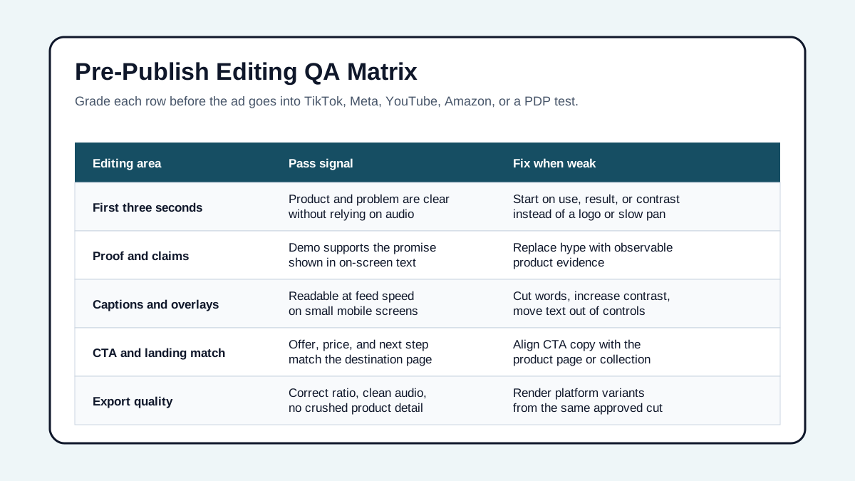
The final QA pass should happen outside the editing tool. Export the video, send it to a phone, and review it in three passes.
Phone Pass
Watch the video at normal phone brightness. Check whether the product remains sharp, small text stays readable, and the key benefit is visible without zooming. If the product detail gets crushed by compression, simplify the scene or increase close-up time.
Mute Pass
Watch without sound. The story should still make sense through visuals, captions, and sequencing. If the viewer needs the voiceover to understand the offer, rewrite the captions or reorder the shots.
Landing-Page Pass
Open the destination page beside the video. Check that the offer, product name, variant, proof point, and CTA match. If the ad claims "waterproof" but the product page says "water resistant," fix the ad. If the video shows a bundle that is not the default page view, send traffic to the bundle page or change the cut.
Example: A 20-Second Ecommerce Product Video Edit
Here is a simple structure for a product video ad before launch:
| Time | Scene | Editing purpose |
|---|---|---|
| 0-2s | Product solving a visible problem | Hook attention and show relevance. |
| 2-5s | One-line problem caption plus product close-up | Confirm what the viewer is looking at. |
| 5-9s | Demo step or feature proof | Support the main claim visually. |
| 9-13s | Result, review cue, or comparison | Build confidence without overclaiming. |
| 13-17s | Variant, bundle, or use-case shot | Answer the next buying question. |
| 17-20s | CTA matched to the landing page | Tell the viewer what to do next. |
This structure is not a formula for every product. It is a useful starting point when a cut feels unfocused. If you need more performance review criteria after launch, use video ad metrics for ecommerce product videos.
Final Pre-Publish Checklist
Use this checklist before handing the video to media buying, marketplace upload, or a product page owner.
- Product is visible in the first two seconds.
- First frame works as a thumbnail.
- Hook names the problem, benefit, contrast, or result.
- Every major claim has nearby visual proof.
- Captions are short, readable, and synchronized.
- Product details are not hidden behind stickers, UI zones, or subtitles.
- Voiceover, captions, and visuals say the same thing.
- CTA is specific and matches the destination page.
- Offer, price, shipping, and promo timing match the landing page.
- Video does not imply a fake endorsement or unrealistic result.
- Product color, size, texture, and package are represented accurately.
- Exported variants match the intended placements.
- Audio is clean, not clipped, and not essential to comprehension.
- Final file opens correctly on a phone.
- The winning version is named clearly so future tests can trace the edit.
FAQ
What should be first in a product video ad?
Start with the product, the customer problem, or the result the product creates. For ecommerce ads, a logo-only intro or slow lifestyle setup usually delays the information shoppers need most.
How long should an ecommerce product video ad be?
Many paid social product ads work best when they are short enough to understand quickly, often around 15-30 seconds, but length should follow the job. A retargeting demo or product detail page video can be longer if every scene answers a buying objection.
Should product video captions match the voiceover exactly?
Not always. Captions should preserve meaning, not necessarily every word. Use shorter caption blocks that highlight the problem, benefit, proof point, and CTA while the voiceover carries more detail.
What is the biggest editing mistake in ecommerce video ads?
The biggest mistake is separating claims from proof. If the edit says the product is faster, easier, cleaner, stronger, or more comfortable, the nearby shot should make that claim believable.
Can AI-generated product videos use this checklist?
Yes. AI-generated cuts still need human QA for product accuracy, caption clarity, claims, platform fit, and landing-page consistency. Use the checklist before testing any AI-generated ecommerce ad.