
Product video color grading is not about making every ecommerce ad look cinematic. It is about making the product look accurate, readable, and worth clicking in a crowded mobile feed. A grade that makes a jacket look more premium but changes navy into black can create customer confusion. A grade that makes skin tone warm but washes out a beige product can weaken the proof shot.
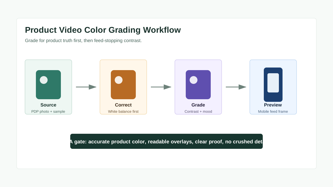
For ecommerce ads, the best color workflow protects the buyer's trust first. Correct the clip so the product matches the product detail page, then apply a restrained grade that improves contrast, text readability, and the first-frame preview.
Quick Answer
Use product video color grading after basic color correction. First match white balance, exposure, and product color to the product page or physical sample. Then apply a light creative grade for the platform: brighter contrast for TikTok and Reels, accurate detail for Amazon product videos, and readable overlays for YouTube or Meta placements. Before export, compare the graded video against the PDP image, test text contrast on a phone, and reject any version that changes the product's color, material, or proof claim.
If you are generating product videos from images, start with clean product inputs in the ShopShot AI video generator, then treat color QA as a separate review step before publishing.
Color Correction vs Color Grading
Color correction and color grading are related, but they solve different problems. Mixing them up is the fastest way to create videos that look polished but sell the wrong product.
| Step | Main job | Ecommerce risk if skipped | Example |
|---|---|---|---|
| Color correction | Make the footage look technically accurate | Product color, skin tone, and white packaging drift | A white skincare bottle turns blue under cool lighting |
| Color grading | Add a controlled visual style | Mood overwhelms product proof or text readability | A warm LUT makes a beige sofa look orange |
| QA review | Compare against product truth and platform preview | The ad gets clicks but creates refund risk or low trust | A green variant appears closer to teal in the final export |
For product ads, correction comes before grading. Do not apply a LUT, filter, or AI enhancement until the baseline clip already matches the product detail page. Google Merchant Center image guidance asks product images to show the correct color, pattern, and material for the item being sold; the same trust principle should guide video, even when the ad platform does not phrase it as a color-grading rule.
Why Color Grading Matters for Ecommerce Ads
Color is a conversion signal. Buyers use it to judge material, finish, quality, and fit. In product video ads, color also controls whether the hook is visible in the first second.
The goal is not maximum saturation. The goal is a visual balance that helps the shopper understand the product faster.
| Ad element | What color grading should improve | What it should not do |
|---|---|---|
| Product reveal | Make the product pop from the background | Change the actual variant color |
| Texture detail | Preserve fabric, gloss, grain, or liquid texture | Crush shadows until detail disappears |
| Before/after proof | Make the result easy to compare | Exaggerate a result claim visually |
| Text overlays | Increase readability on small screens | Put pale text over bright footage |
| Brand feel | Keep the ad consistent with brand assets | Make every platform version look unrelated |
This is especially important when you repurpose one asset across TikTok, Meta, Amazon, Shopify pages, and YouTube Shorts. The same grade can look clean on desktop but too dark on a phone, or strong on TikTok but inaccurate on an Amazon detail-page environment.
For page-level product assets, pair this workflow with the Shopify product video checklist. For marketplace videos, also check the Amazon product video workflow.
A Practical Product Video Color Grading Workflow
Use this workflow for AI-generated product videos, creator UGC, studio clips, and repurposed PDP videos.
1. Set the Product Truth Reference
Before you touch the grade, define the reference.
Use one of these as the color truth:
- The live product detail page image.
- A manufacturer product image.
- A physical sample under neutral light.
- A color swatch or packaging reference.
- A previous approved brand video.
If the product has variants, keep each variant separate. Do not grade a red, burgundy, and rose product with the same preset unless you compare all three after export. Amazon's Sponsored Products video guidance notes that child ASIN color or size variations may need video at the variation level so the video reflects the same variation shown on the product detail page.
2. Correct Exposure Before Style
Correct exposure, white balance, and contrast before applying a creative grade.
Use this order:
- Fix white balance so whites, neutrals, and packaging look neutral.
- Adjust exposure so the product is visible without clipping bright areas.
- Recover shadows if texture or product edges disappear.
- Reduce over-saturation if the product color is drifting.
- Only then apply a light creative look.
A common ecommerce mistake is adding contrast too early. It makes the frame feel punchier, but it can hide stitching, texture, ingredient labels, matte finish, or small parts that help the buyer understand the product.
3. Grade for the Placement
Each placement changes the grading decision.
| Placement | Color priority | Practical grading note |
|---|---|---|
| TikTok / Reels | Fast visual clarity and native feel | Use bright contrast, but keep product and face tones natural |
| YouTube Shorts | First-frame attention and readable captions | Make the first second visually clear without relying on tiny text |
| Meta Feed / Reels | Safe-zone readability across crops | Test text and product visibility inside placement previews |
| Amazon video | Product accuracy and detail | Avoid stylized grades that change material or variant color |
| Shopify PDP | Trust and consistency with product images | Match product photos more than social trends |
Google's YouTube Ads ABCDs framework emphasizes attention, branding, connection, and direction; color grading supports those goals only when it helps the viewer notice the product and understand the next action. TikTok's Creative Center and Creative Codes also point advertisers toward platform-native creative learning rather than generic polish. Use those tools to study pacing and visual language, then adapt the grade to your own product.
4. Protect Text and Offer Readability
Most ecommerce product ads use text: price, benefit, review quote, claim, bundle, coupon, or CTA. Color grading can break those overlays.
Use a quick contrast check:
- View the video at phone size, not just on a desktop monitor.
- Watch it with brightness at 50%.
- Pause on every frame with text.
- Check whether captions remain readable over the brightest and darkest parts of the footage.
- Add a translucent backing plate or stronger font weight if needed.
The W3C contrast guidance for web text uses 4.5:1 for normal text and 3:1 for large text. Paid social platforms are not asking you to calculate WCAG ratios for every video frame, but the rule is useful: if text cannot survive low brightness, motion, and compression, the grade is not ready.
For caption-heavy videos, use the deeper product video captions QA guide.
5. Check Proof Shots Separately
Proof shots need stricter grading than mood shots. A before/after frame, review result, ingredient texture, color payoff, fit demonstration, or product comparison should never rely on an exaggerated grade.
Use this rule:
If the buyer would feel misled when the product arrives, reduce the grade.
That matters for categories such as:
- Apparel colors and fabric texture.
- Beauty shades and skin finish.
- Home decor materials.
- Food texture and freshness.
- Electronics screen color and brightness.
- Fitness equipment finish and scale.
If a claim is visual, keep it conservative. Pair color review with the product video proof points guide and the product video compliance checklist.
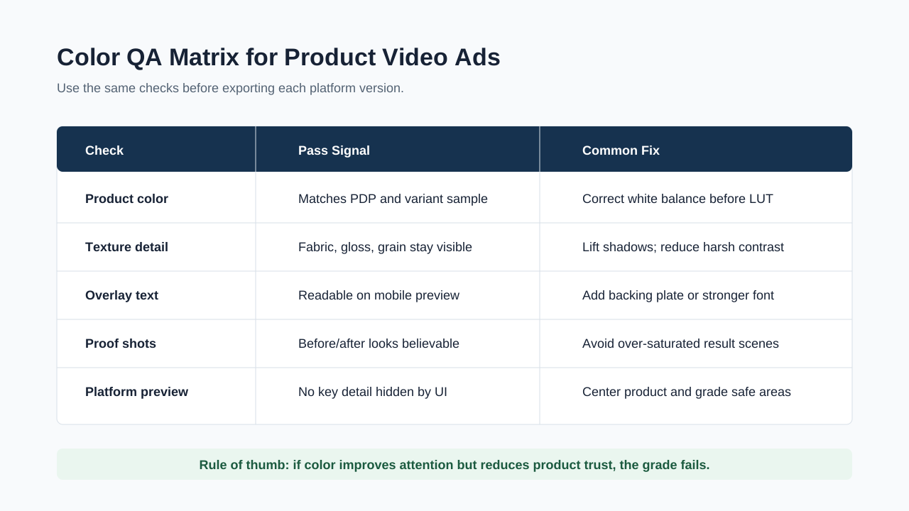
Product Video Color QA Matrix
Run the same QA before exporting each platform version.
| QA check | Pass condition | Fail signal | Fix |
|---|---|---|---|
| Product color | Product matches PDP or approved sample | Variant looks warmer, cooler, darker, or more saturated | Correct white balance, reduce saturation, compare side by side |
| Skin tone | Presenter looks believable | Skin turns orange, gray, red, or plastic | Adjust temperature and tint before LUT |
| Texture detail | Buyer can see surface, finish, label, or material | Shadows are crushed or highlights are blown | Lift shadows, lower contrast, recover highlights |
| Overlay readability | Hook, claim, caption, and CTA are readable on mobile | Text disappears over bright footage | Add backing plate, outline, or crop change |
| Platform preview | Product and CTA survive crop and UI | Product is hidden by buttons or captions | Reframe before export |
| Compression preview | Grade still works after export | Banding, blocky shadows, or muddy color appears | Lower saturation, export at cleaner settings |
For export-specific checks, use the product video export settings guide. A grade that looks good in the editor can fall apart after compression if the shadows are too dark or gradients are too smooth.
Recommended Grade by Product Category
Do not use one LUT across every product category. Choose the grade based on what the buyer needs to evaluate.
| Product category | Best color direction | Avoid |
|---|---|---|
| Beauty and skincare | Accurate skin tone, clean whites, natural highlights | Heavy smoothing, orange skin, unrealistic before/after |
| Apparel | True color, visible fabric texture, neutral background | Saturation that changes shade or pattern |
| Home goods | Warm but believable room light | Over-warm whites that change material color |
| Food and beverage | Fresh color, appetizing contrast, texture detail | Greenish whites, crushed dark scenes, fake gloss |
| Electronics | Neutral screen and product finish | Boosted screen color that misrepresents display quality |
| Fitness and outdoor gear | Clear contrast and material detail | Dark grades that hide straps, seams, or scale |
For multilingual or regional ad variants, do not assume the same grade works everywhere. Different markets may use different product pages, packaging, labels, or model shots. The product video localization guide covers how to review localized versions without losing product trust.
How to Use AI Without Losing Product Accuracy
AI tools can speed up product video creation, but they can also introduce color drift. When generating videos from product images, prompt for accuracy before style.
Use prompts like:
- "Keep the product color identical to the reference image."
- "Use neutral lighting and preserve fabric texture."
- "Do not change packaging color, logo color, or label text."
- "Use a clean ecommerce ad look, not a cinematic filter."
- "Preserve the exact shade of the product variant."
Then review the output as if it came from a human editor. Compare the first frame, product reveal frame, proof frame, and final CTA frame against the source image.
ShopShot is useful here because you can generate multiple creative directions quickly, then keep only the versions that pass product-color QA. Speed does not remove review; it makes review more important because you can create more variants in less time.
A 15-Minute Color Review Checklist
Use this checklist before publishing an ecommerce product video ad.
- Put the final video next to the product detail page image.
- Pause on the product reveal frame and compare variant color.
- Pause on every proof shot and check whether the result looks exaggerated.
- Watch the ad on a phone at 50% brightness.
- Check captions, price, offer, and CTA readability.
- Preview the platform crop if the ad will run in Reels, Stories, Shorts, or feed.
- Export one test file and inspect for compression banding or muddy shadows.
- Ask one person who has not seen the edit what color the product is.
- Archive the approved reference frame so future variants match.
This is a small step, but it prevents a common scaling problem: after a team creates 20 ad variants, every version slowly drifts away from the product page.
Common Color Grading Mistakes
Using a Cinematic LUT on Every Ad
Cinematic LUTs often reduce saturation, tint shadows, or warm highlights. That can look premium, but it can also hide product detail. Use them sparingly and lower the intensity.
Grading for Desktop Instead of Mobile
Most paid social viewing happens on phones. A grade that looks subtle on a large monitor may look flat or muddy on a small screen. Always review at phone size.
Treating Before/After Frames Like Mood Shots
Before/after frames carry proof. Keep them neutral enough that the result looks believable.
Ignoring Platform UI
Meta's public safe-zone guidance warns advertisers to keep key creative elements away from edges in 9:16 Stories, Reels, Feed, and in-stream Reels placements. Color review should happen after crop and safe-zone review, because a bright CTA can still fail if the platform UI covers it.
Forgetting the Product Page
The ad is not the final destination. If the product page uses neutral product photography but the ad uses a heavy warm grade, the click can feel inconsistent. That friction hurts trust.
FAQ
What is product video color grading?
Product video color grading is the creative color pass applied after basic correction. For ecommerce ads, it should make the product easier to notice while preserving accurate product color, texture, and proof shots.
Should ecommerce ads use LUTs?
Yes, but use LUTs lightly. Apply them after correction, reduce intensity, and compare the result against the product page. If the LUT changes the product variant color, do not use it.
What is the difference between color correction and color grading?
Color correction fixes technical accuracy: white balance, exposure, and product color. Color grading adds style: contrast, warmth, mood, and brand feel. Product videos need correction before grading.
How do I know if a product video grade is too strong?
The grade is too strong if the product no longer matches the PDP image, text becomes hard to read, proof shots look exaggerated, or the video looks good in the editor but muddy after export.
Can AI-generated product videos keep accurate colors?
They can, but only with source images, clear prompts, and human QA. Ask the tool to preserve exact product color and packaging, then compare final frames against the approved product reference.
Sources Checked
- Google / YouTube Ads ABCDs of effective video ads
- TikTok For Business Creative Center help
- TikTok Creative Codes for ads
- Amazon Sponsored Products video guide
- Amazon Sponsored Brands video specs and guidelines
- W3C WCAG contrast guidance
- Google Merchant Center image link guidance
Conclusion
Product video color grading should make ecommerce ads clearer, not less honest. Correct the product first, grade lightly, test on a phone, and compare the final export against the product page. If the ad becomes more attractive but less accurate, the grade failed.
Create the video variant with ShopShot, then use this color QA workflow before you publish. That keeps speed, polish, and product trust moving in the same direction.