
Quick Answer
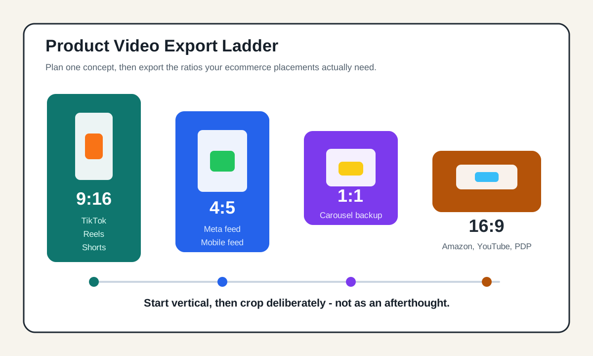
For ecommerce ads, the safest product video aspect ratio plan is to create one vertical 9:16 master, then export 4:5, 1:1, and 16:9 versions from the same storyboard. Use 9:16 for TikTok, Reels, Stories, Shorts, and full-screen mobile placements. Use 4:5 for Meta feed when you want more mobile screen space without a full-screen crop. Use 1:1 when you need a flexible square backup for feeds, carousels, and mixed inventory. Use 16:9 for YouTube in-stream, Amazon Sponsored Brands video compatibility, PDP embeds, and desktop-first placements.
The ratio is not just a technical upload detail. It decides where the product sits, whether captions cover proof points, how much of the hand demo survives the crop, and whether the CTA looks intentional or cramped.
Why Aspect Ratio Changes Product Video Performance
Most ecommerce teams do not lose ad quality because they chose the wrong camera. They lose it when one video is forced into every placement.
A 16:9 product demo might look clean on a product detail page, but it often becomes a thin strip inside a vertical feed. A 9:16 TikTok-style product video can feel native on mobile, but it may crop awkwardly when reused in a 1:1 carousel or a wide YouTube placement. A square crop can be useful, but it can also waste vertical space when the placement is full screen.
The practical goal is not to memorize every platform spec. The goal is to design the product video so the same idea can survive multiple crops:
| Ratio | Best use | Ecommerce risk | Production rule |
|---|---|---|---|
| 9:16 | TikTok, Reels, Stories, Shorts, mobile-first ads | Captions and UI can cover product details | Keep the product and proof in the center safe area |
| 4:5 | Meta and Instagram feed | Top or bottom text can be trimmed in automated crops | Use it for feed-first ads with large product framing |
| 1:1 | Carousels, mixed feeds, flexible backup | Can feel less native in full-screen placements | Keep the product large and reduce empty background |
| 16:9 | YouTube, Amazon, PDP, desktop embeds | Looks small in vertical feeds | Use for demos, explainers, and marketplace compatibility |
If you plan ratios before production, you can shoot or generate one concept with deliberate safe areas. If you think about ratios after the edit is done, you usually end up with emergency crops.
The Ecommerce Ratio Stack To Export
For most small ecommerce brands, a four-export stack is enough:
- 9:16 vertical master.
- 4:5 mobile feed cut.
- 1:1 square backup.
- 16:9 wide cut.
This stack covers the most common paid and organic product-video workflows without turning the project into a full production department.
9:16: The Mobile-First Product Video Cut
Use 9:16 when the placement is built for a full-screen mobile experience. TikTok auction in-feed ads list vertical 9:16 as the recommended format, with square and horizontal options also supported. Meta also recommends 9:16 for placements such as Stories and Reels. Google notes that vertical video is best suited for Shorts.
For ecommerce, 9:16 works best when the product is visible in the first second and the frame does not depend on tiny desktop-style text. Build the creative around a tall layout:
| Vertical layer | What to place there | What to avoid |
|---|---|---|
| Top area | Hook, category cue, visual contrast | Critical price, coupon code, legal claim |
| Center area | Product, hand demo, before-after, key proof | Empty lifestyle background |
| Lower-middle area | Caption line or benefit | Tiny paragraphs |
| Bottom area | Soft CTA, product name, offer reminder | Important details near platform buttons |
For more platform detail, pair this article with the TikTok ad specs checklist and the YouTube Shorts specs guide.
4:5: The Feed Cut For Meta And Instagram
The 4:5 crop is useful when the ad needs to feel large in a mobile feed but does not need the full 9:16 canvas. Meta supports both 1:1 and 4:5 for images and videos across many feed-style placements, and its placement guidance separates feed ratios from full-screen placements.
Use 4:5 when:
- The product needs more height than a square frame provides.
- You want the video to look native in feeds.
- The first frame needs to show the product, a short headline, and a proof point together.
- You are adapting a 9:16 master into a feed placement without losing the product.
The common mistake is to crop a 9:16 ad straight down to 4:5 after the text is already locked. Instead, design the vertical master with a center-safe product zone, then resize text and CTA elements for the 4:5 cut.
See the Meta video ad specs guide when you need placement-specific ratios, safe-zone details, and export checks.
1:1: The Flexible Square Backup
Square 1:1 is not always the best-looking ecommerce format, but it is a useful backup. It can fit feed, carousel, and mixed inventory more predictably than a tall or wide export. Google video asset specs include square as a core ratio, and Meta supports square in feed-style placements.
Use 1:1 for:
- Product comparison clips.
- Offer reminders.
- Review quote videos.
- Catalog-style carousels.
- Retargeting creatives where the audience already knows the product.
The square cut needs large product framing. If the product is small, 1:1 becomes a generic brand tile instead of a sales asset. Avoid putting the headline at the top and the CTA at the bottom with a tiny product in the middle. Flip that priority: product first, proof second, CTA third.
16:9: The Wide Cut For YouTube, Amazon, PDPs, And Desktop
Use 16:9 when the placement expects a horizontal video or when the viewer is likely to watch on desktop. Google Ads lists 16:9 as the horizontal video ratio. Amazon Sponsored Brands video specs commonly use 16:9 for standard Sponsored Brands video assets, while Amazon has separately documented vertical Sponsored Brands video availability for certain goals and formats. Shopify product pages and many PDP embeds also tend to handle wide video cleanly.
For ecommerce, 16:9 is strongest for:
- Product demos with hands, surfaces, or context.
- Founder or expert explainers.
- Amazon Sponsored Brands video compatibility checks.
- YouTube in-stream or product education videos.
- PDP media galleries where the video sits beside product images.
If you use 16:9, make the product fill more of the frame than a normal brand film would. A wide shot of a kitchen, desk, or bathroom may look polished, but it can hide the product benefit.
For Amazon-specific requirements, use the Amazon Sponsored Brands video checklist before upload.
A Practical Export Matrix By Placement
Use this matrix when you are deciding what to export from one product video concept.
| Placement or use case | Primary ratio | Backup ratio | Notes |
|---|---|---|---|
| TikTok in-feed product ad | 9:16 | 1:1 or 16:9 if required | Vertical is the native starting point |
| TikTok Shop product content | 9:16 | 1:1 | Keep product, demo, and price proof away from UI edges |
| Instagram Reels or Stories ad | 9:16 | 4:5 for feed reuse | Leave edge space for platform UI and captions |
| Facebook or Instagram feed | 4:5 | 1:1 | 4:5 gives more mobile screen area than square |
| Meta carousel product proof | 1:1 | 4:5 | Keep each slide visually consistent |
| YouTube Shorts | 9:16 | 1:1 only if not Shorts-first | Treat as a vertical short, not a resized TV ad |
| YouTube in-stream | 16:9 | 1:1 for some campaign mixes | Start with wide if the viewer watches before or during video content |
| Google Demand Gen or Performance Max | 9:16, 1:1, 16:9 | 4:5 where accepted | Upload a variety of ratios to improve eligibility |
| Amazon Sponsored Brands video | 16:9 | Verify vertical availability in campaign builder | Standard specs still emphasize wide assets |
| Shopify or ecommerce PDP gallery | 16:9 or 1:1 | 9:16 for mobile PDP sections | Keep media ratios consistent with the theme layout |
The matrix is intentionally conservative. Platforms update creative support often, and campaign builders can expose different options by objective, account, country, or placement. Always check the current upload screen before final export.
How To Plan One Product Video For Four Ratios
A good multi-ratio product video starts with the storyboard, not the export menu.
Step 1: Write The Ratio-Aware Shot List
Start with a simple shot list:
| Shot | Purpose | Safe-framing note |
|---|---|---|
| Product hero | Show what the item is | Center product, leave top and bottom space |
| Problem moment | Show why the buyer cares | Keep hands and product inside the 4:5 crop |
| Feature proof | Show mechanism or result | Avoid tiny text; use visual proof |
| Social proof | Quote, review, or rating | Keep text short enough for 1:1 |
| CTA | Next action | Put CTA away from UI-heavy lower corners |
If you need a fuller planning template, start with the product video shot list template.
Step 2: Design The Center-Safe Master
The center-safe master is usually a 9:16 layout with the product, hands, and main proof point in the middle. You can crop this into 4:5 and 1:1 more easily than you can rescue a wide video that never planned for vertical.
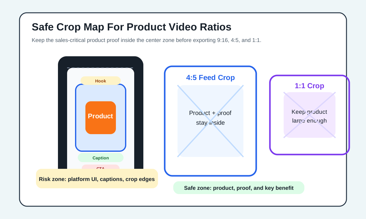
Use this hierarchy:
- Product visibility.
- Demonstration or proof.
- One-line benefit.
- Caption or voiceover support.
- CTA.
Do not place all five layers at the same time. Product ads get weaker when every frame tries to do every job.
Step 3: Export The Ratios Before Final QA
Do not approve the master video and then delegate the ratios as a final formatting task. Export the four cuts before QA so you can catch:
- Cropped product edges.
- Hidden price or offer text.
- Captions behind platform UI.
- Hands cut off during demos.
- CTA text that becomes too small.
- Review screenshots that become unreadable.
Use the same naming convention for every asset:
| Asset | Example filename |
|---|---|
| 9:16 master | sku-hook-proof-cta-9x16.mp4 |
| 4:5 feed | sku-hook-proof-cta-4x5.mp4 |
| 1:1 square | sku-hook-proof-cta-1x1.mp4 |
| 16:9 wide | sku-hook-proof-cta-16x9.mp4 |
This keeps media buyers, designers, and store operators from uploading the wrong file to the wrong placement.
Product Category Examples
Different products need different framing. The ratio decision should follow the product behavior, not just the platform.
| Product type | Best first ratio | Why | Crop warning |
|---|---|---|---|
| Beauty product | 9:16 | Face, hand, texture, and application read well vertically | Keep claims and ingredient text short |
| Home decor | 16:9 or 4:5 | Room context matters | Do not make the product too small |
| Apparel | 9:16 | Full-body fit and motion need height | Leave space above head and below shoes |
| Electronics | 16:9 and 1:1 | Desk setup and ports need clear framing | Macro shots may crop poorly in 9:16 |
| Food and beverage | 9:16 or 4:5 | Pour, bite, and texture clips work on mobile | Avoid captions over steam or texture |
| Jewelry | 1:1 or 9:16 | Close-up detail and motion both matter | Reflections can hide in compressed exports |
If you generate product videos with ShopShot's AI video generator, treat the first output as the creative concept, then run a ratio QA pass before using it in ads. A concept can be strong and still need ratio-specific cropping.
Ratio QA Checklist Before Upload
Run this checklist before a product video goes live:
| Check | 9:16 | 4:5 | 1:1 | 16:9 |
|---|---|---|---|---|
| Product visible in first second | Yes | Yes | Yes | Yes |
| Benefit readable without sound | Yes | Yes | Yes | Usually |
| Captions away from UI edges | Yes | N/A | N/A | N/A |
| CTA is not cropped | Yes | Yes | Yes | Yes |
| Product proof stays legible | Yes | Yes | Yes | Yes |
| File matches platform upload requirements | Yes | Yes | Yes | Yes |
| Thumbnail or first frame makes sense | Yes | Yes | Yes | Yes |
Then do a placement-specific check:
- For TikTok Shop or TikTok ads, confirm the creative follows the current TikTok product video workflow and ad specs.
- For Meta, compare the cut against the Facebook ads tool page and Meta specs article.
- For Google and YouTube, use the Google Ads video specs guide and YouTube Shorts tool page.
- For Amazon, confirm the current campaign type on the Amazon tool page and the Sponsored Brands checklist.
- For PDP use, test the video in the product page layout, not only in a media player.
Common Aspect Ratio Mistakes
Mistake 1: Starting With 16:9 For A Mobile-First Campaign
If the campaign depends on TikTok, Reels, Stories, or Shorts, start with vertical. A wide master can work for product education, but it often becomes weak when cropped into a full-screen mobile feed.
Mistake 2: Putting Text At The Very Top Or Bottom
Platform UI, captions, buttons, and ad labels can compete with your text. Keep critical text near the center, especially in 9:16 ads.
Mistake 3: Treating 1:1 As The Universal Compromise
Square is flexible, but it is not a magic answer. If the ad needs a native TikTok feel, 1:1 will usually feel less immersive. If the ad needs an Amazon or YouTube-style explainer, 1:1 can feel cramped.
Mistake 4: Forgetting The Product Page
Many ecommerce teams optimize for paid social and forget the product detail page. If the same video will live on a Shopify PDP, Amazon listing, or landing page, make a version that looks deliberate in that environment. Use the product video landing page checklist when the video supports a paid landing page.
Mistake 5: Cropping After Text Animation Is Locked
Animated text that looks good in 9:16 can become unreadable in 4:5 or 1:1. Finish rough ratio exports before final motion polish.
A Simple Production Workflow
Use this workflow for each new ecommerce product video:
- Choose the primary placement.
- Pick the primary ratio.
- Write the storyboard with center-safe product framing.
- Generate or shoot the product demo.
- Add captions and proof points inside the safe area.
- Export 9:16, 4:5, 1:1, and 16:9.
- QA each cut against the placement.
- Name files clearly.
- Upload only the matching ratio to each campaign or page.
- Track results by ratio, not only by hook.
This gives you cleaner creative data. If the 9:16 cut wins on TikTok and the 4:5 cut wins in Meta feed, you learn something about format fit. If you only upload one compromised ratio everywhere, you cannot separate the hook from the crop.
FAQ
What is the best product video aspect ratio for ecommerce ads?
For mobile-first ecommerce ads, start with 9:16, then create 4:5, 1:1, and 16:9 exports for feed, square, wide, and PDP placements. The best ratio depends on where the ad will run.
Should I make one product video for every platform?
Use one concept, not one final file. Keep the hook, proof, and CTA consistent, but export placement-specific ratios so the product stays visible and the text does not get cropped.
Is 4:5 better than 1:1 for Meta product video ads?
Often, 4:5 gives more mobile feed space than 1:1, but 1:1 is still useful for carousels, mixed inventory, and backup assets. Test both if the product and offer matter enough.
Can I reuse a TikTok product video on Amazon?
Sometimes, but do not assume a 9:16 TikTok video is ready for Amazon. Many Amazon video placements still require or strongly favor 16:9 assets, and campaign options can vary. Export a wide version and check the current Amazon Ads upload requirements.
How many ratio versions should a small ecommerce team create?
Create four versions for important campaigns: 9:16, 4:5, 1:1, and 16:9. For a quick organic test, start with 9:16 and add other ratios only if the video becomes a paid or PDP asset.
Sources Checked
- TikTok Ads Manager: auction in-feed ads
- Meta Business Help: best practices for aspect ratios across placements
- Meta Business Help: text overlays and safe zones for Stories and Reels ads
- Google Ads Help: about video ad specs
- Google Ads Help: use square and vertical video to engage mobile customers
- Amazon Ads: Sponsored Brands video ad specs and guidelines
- Amazon Ads: vertical Sponsored Brands video creatives announcement
- Shopify Help: product media types